iPhone 6 – Shedding the past
The iPhone 6. We’ve gone through three iterations of this iconic smartphone since the passing of Steve Jobs, and Apple has made some interesting strategic decisions in its product design that only could have happened under the direction of Tim Cook.
I owned the iPhone 5s for just under a year, after upgrading from an aging iPhone 4 that was struggling to run iOS7. My lust for the newest generation was fuelled by the constant need for extra storage and curiosity towards owning a larger device.
Apple has decided to go full minimal with the packaging design – it features a light emboss of the phone encased within. Simple and representational.
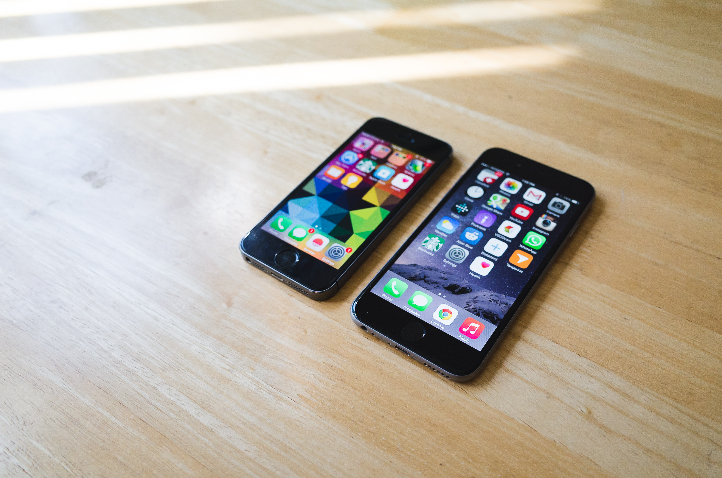
4.7” doesn’t sound large in today’s standards, but the iPhone 4 looks comically small next to this gargantuan. It's interesting how Apple stuck to its guns with the 3.5" display until the 4S, but has already changed form factors twice in three iterations.
Having owned three of Apple’s previous 3.5” iPhones, the jump to the 4” display of the iPhone 5s was an awkward transition. I’m faced with this leap once again, but it wasn’t as difficult as I expected. This jump in size requires your hands to become familiarized with this seemingly familiar, yet different device.
As smartphone adoption became ubiquitous amongst the developed world, the demand for larger devices grew out of our increased dependence on mobile devices. The casual user sees more value in convenience, preferring the device in their pocket, than the one they have to haul around in their bag.
When the smartphones started to catch traction, we expected one-handed usability because it was a standard we expected from our old dumbphones. That standard changed as years passed. Smartphones evolved, and we did more with them. We saw a need for a larger screen to alleviate the increased frequency of interaction and variety of everyday tasks.
Personally, I think that it's a very fair tradeoff.
I opted for the 6 instead of the 6+, because I still rely heavily on my Macbook Air for productivity, and I’m simply not a fan of the enormous phablets on the market today.
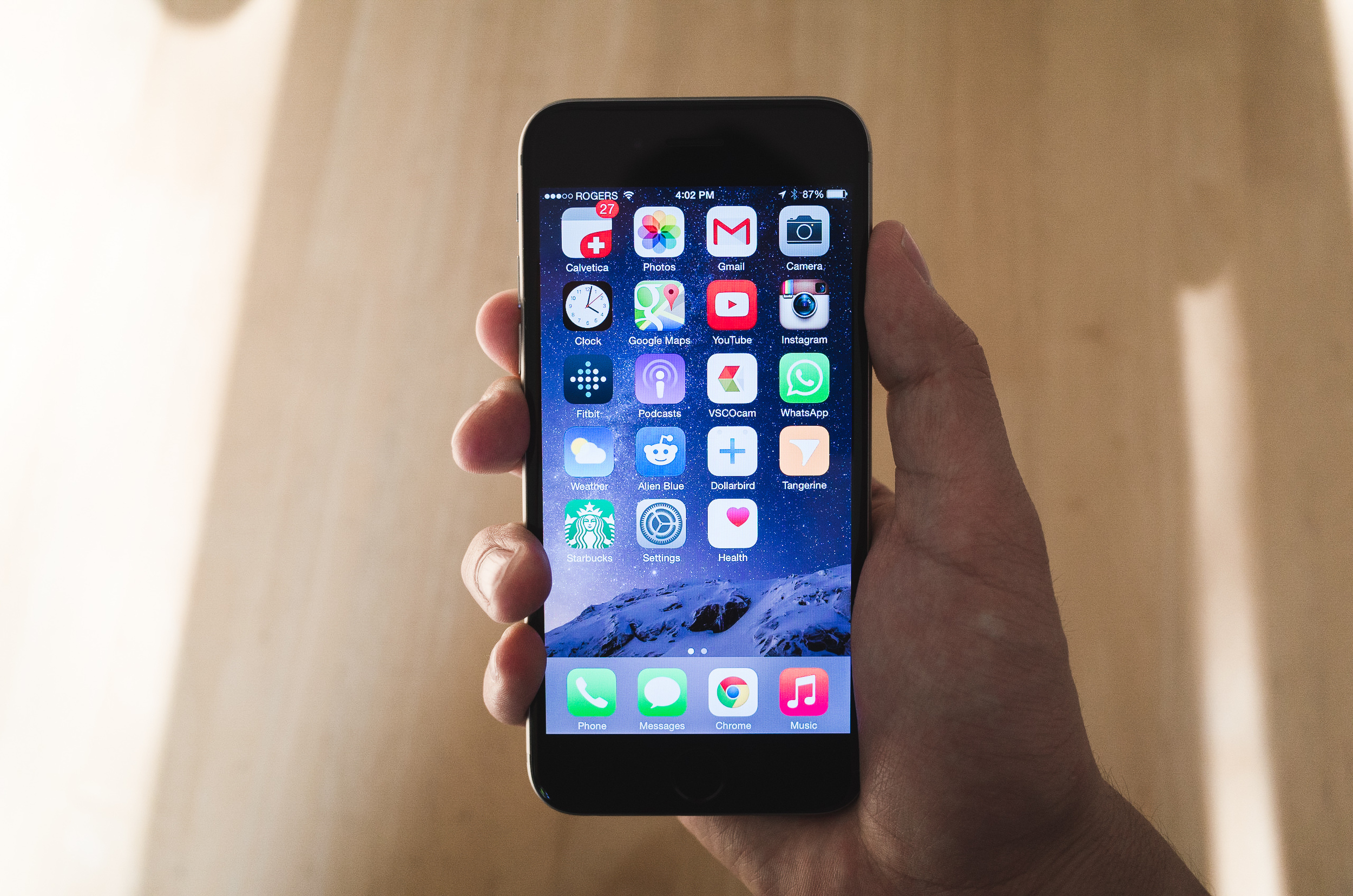
I don’t own a tablet, so this is my go-to device for everything casual. I’ve appreciated the larger display in everyday usage, whether it’s browsing Reddit or watching videos on YouTube. The larger size definitely makes the viewing experience better, but I’m still waiting on many apps to be optimized for the higher resolution.
The Retina display seems relatively unchanged from previous generations. Colours are rendered a tad bit cooler than the 5s.
To put it frankly, I think the iPhone 6 is ugly.
Apple was once a company that strove to develop hardware that was beautifully designed. I’m not sure exactly what happened with the 6. These plastic antennas that run across the rear make the device look cheap and distract the eyes from an otherwise simplistic and classy look.
I don't understand how the designers green lit this disgusting protrusion in the lens design. This is a step backwards in both aesthetics and functionality.
The lens is unsightly and prevents the device from sitting flat on a surface.
Within 24 hours of having this device, the bezel was scuffed and dust entered the lens construction.
The placement of the camera lens has also been a design quirk that has bothered me since the 5, however the 6 just made it a tad bit worse. I’m not sure why they never made the lens placement equidistant to the edges like they did with the 4. The neighbouring antennas make it seem even worse.
The iPhone 6 is also marks Apple’s departure of its design cues stemming from the iPhone 4.
Gone is the sharp, no-nonsense design that we’re so familiar with. The rounded edges should speak for themselves. The iPhone 6 looks bubbly and welcoming, whereas the 5s looks cold to the touch and efficient.
I miss the chamfered edges of the 5s.
Although I wasn't the biggest fan of the 5s' rear design, there was a beautiful contrast of the Space Grey with the black ceramic pieces. With the iPhone 6, it looks a bit too light, even silver-ish to my eyes. A shade darker would have looked great in my opinion.
The openings for the speaker and microphone also became larger and less in number. A weird approach after the 5s and its microholes that were so elegant and almost Lumia-esque.
The slipperier metal construction of the rear compounded with the larger size, holding the iPhone 6 becomes rather worrisome. You simply don’t get the same level of grip as with previous iterations.
However, I must say that the curved glass on the edge of the display works beautifully with iOS’ swiping gesture. Whereas on the 5s it seemed a bit awkward and abrupt, the swiping motion along the edge and onto the screen feels incredibly natural on the 6.
Fortunately for me, the physical issues I have with the iPhone 6 can be remedied with a case. Not the ideal situation, but it is what it is.
Following suit with the launch of the 5s, Apple released accompanying leather cases. I snagged the black one, as I realized the lighter coloured ones get discoloured very easily by denim.
It hides the antenna and lens bulge, prevents more scuffs on the lens trim, and improves one-handed grip.
This case doesn't have as tight a fit as the 5/5s cases, due to the lack of protection on the bottom. While it's a great case made from high-quality materials, I wouldn't recommend purchasing it. For me, I want a case that fully protects my device and is somewhat difficult to remove. In this case (no pun intended), this product does neither.
Most of my gripes of the iPhone 6 come from the questionable design choices, and not necessarily the hardware or software. However, I'm now in an awkward stance with this phone. At the end of the day, I like the iPhone 6, but that’s pretty much it. I don’t really love it anymore.
Apple’s slogan for the iPhone 6 is ‘Bigger than bigger,’ but I can’t really pinpoint what is so great about this phone, besides the bigger screen. iOS8 has all sorts of features like its integration with Mavericks, but I could’ve gotten the almost the same kind of experience with my 5s.
I find it extremely awkward when people approach me and ask how I think about the 6. As someone who usually enjoys their experience with Apple products, I’m caught without an answer.


